← Back to Case Studies
Bug Lifecycle Dashboard
An end-to-end dashboard revealing ticket bottlenecks across customer support and engineering, empowering leadership with the data to shift resources where they mattered most.
At a Glance
The Challenge: Bottlenecks Without Proof
Bug resolution was slow, and teams often blamed each other without shared evidence. Customer support was frequently labeled the bottleneck, but we lacked data to confirm or challenge that claim. We needed a unified view that showed where issues stalled across the full lifecycle, from initial customer report through engineering resolution, and one that allowed leadership to slice the data by org hierarchy (manager, director, VP).
My Role: Full-Stack Builder & Dashboard Designer
I owned the end-to-end build, from data access and modeling through the dashboard experience design. The goal was simple: make bottlenecks measurable and easy to explore at every level of the org.
- C#: Queried bug systems and built the data bridge.
- Python: Cleaned, normalized, and pre-processed data to keep the dashboard fast.
- Power BI: Designed visualizations and interaction patterns for quick executive-level insight.
Solving the Problem: Building a Unified Bug Lifecycle View
The primary constraints were disjointed HR and bug data, limitations in Power BI for dynamic lists and deep grouping, and performance issues when relying on native transformations alone.
I combined C# for issue querying, Python for preprocessing, and a Power BI dashboard designed for clarity and speed. This approach kept the model deterministic, reduced transformation overhead inside Power BI, and enabled slicing by team hierarchy without the dashboard becoming sluggish.
Design & Architecture Rationale
The dashboard needed to answer one question quickly: where is work actually getting stuck? The design focused on making bottlenecks visible without forcing leaders to inspect raw bug records or argue from anecdotal evidence.
I structured the experience around the way leadership made decisions: by organization, ownership level, lifecycle stage, and elapsed time. That meant the data model had to support both detailed investigation and executive-level scanning without making the dashboard slow or overloaded.
Key tradeoffs included:
- Deciding what to calculate before the data reached Power BI versus what to leave interactive inside the report.
- Preserving enough detail for root-cause investigation while keeping the main views readable for leadership.
- Turning inconsistent ticket data into a stable model without hiding the workflow problems the dashboard was meant to expose.
The Architecture Flow
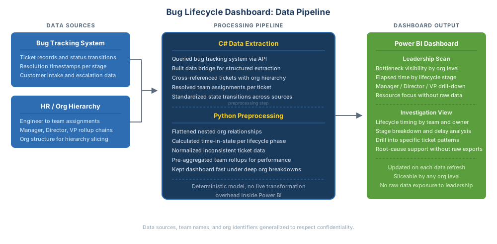
Full data pipeline from source systems through preprocessing to dashboard output. Click to open full size.
Technical Considerations
Power BI struggled with dynamic bug lists and manager-level grouping when transformations were chained inside the report. I used a Python preprocessing step to flatten and normalize the data ahead of time, which kept the dashboard responsive even with deep org breakdowns.
Results, Impact, and Influence
- Provided leadership with an ongoing, trusted view of bottlenecks across support and engineering.
- Enabled repeated, data-driven resource and prioritization decisions over time.
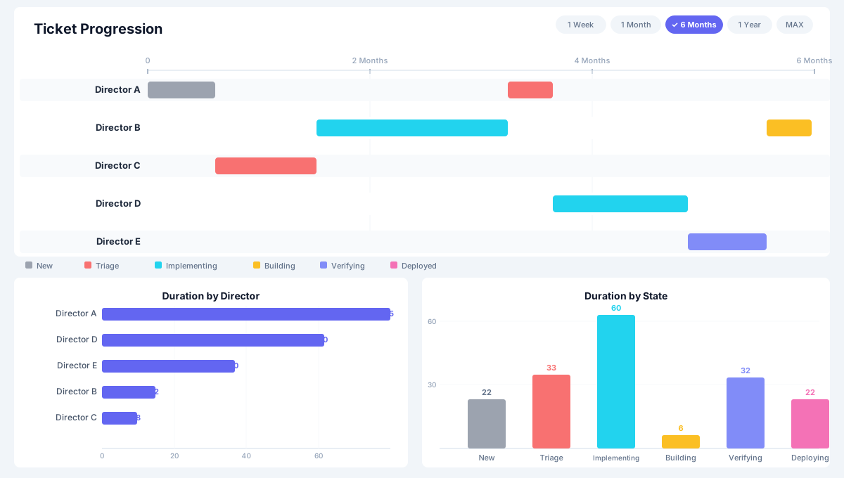
- Disproved the assumption that customer support was the primary bottleneck, refocusing attention on true delays.
The dashboard became a recurring reference point in leadership discussions rather than a one-time analysis.
Stakeholder Feedback
“Exactly the kind of visibility we need, our team is running efficiently, and now we can focus on where the real roadblocks are.”
“Great to see the data confirming what we've suspected. Let's share this with leadership to ensure we're prioritizing the right fixes.”
Why This Work Matters
This dashboard turned anecdotal frustration into defensible data. Leadership gained a single source of truth to guide prioritization with confidence, and the approach created a repeatable pattern for analyzing bottlenecks across other workflows over time.